iOS Icon Template for Perfectionists
![]() Download the modified template
Download the modified template
After creating a few icons with the excellent iPhone 4 icon PSD template from Cocoia, we started noticing the dreaded “black corner pixels” effect on iOS and iTunes, which you see all over the place these days.


Why does this happen? It’s because Apple is very liberal about the compositing of your image.
Let’s say you make a nice icon in Photoshop, and “eyeball” the corners:

When iOS gets ahold of your nice transparent icon, it will immediately slap it on a black background…

…then apply this masking image:
![]()
Now your icon looks like this:

You could sneak this by in the past because the iPhone homescreen was always black anyway. But now that we have customizable homescreen wallpapers, these black corners will be revealed right quick.
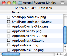
How did we fix this problem? Well first off, we started by rebuilding Cocoia’s template around the system masks we extracted from the iOS firmware.

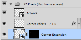
But even designing against the exact masks isn’t enough to avoid a faint black line around the corners. So we also made it easy to “extend” the outer pixels of your icon all the way to the edges using a Smart Object.
 +
+
 =
=

Look carefully at the colors we’ve chosen to extend, it’s not the dark red interior background, it’s the outer pixel:

So now Apple can apply all the masks and effects they want and your icon will still look perfect:

The template leverages Photoshop Smart Objects heavily to ease the burden of designing all your different icon sizes simultaneously.

But here’s the best part: when you’re ready to export
the final output, just unhide the top
Corner Mask preview layer and Save for Web:

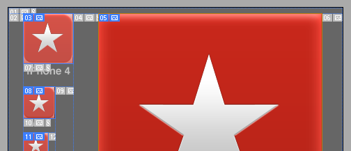
Each icon has its own Slice, set to export with the correct filenames like “Icon.png,” “Icon@2x.png,” and even “iTunesArtwork” for .ipa distribution.
Just one save and you’re done.
Comments? Feedback? Hit me up on Twitter.