A Custom Callout View for iOS
Check out SMCalloutView on Github.
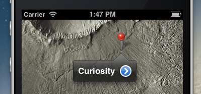
There’s a great UI widget that’s been on iOS since day one:

Ever wonder what that black pointy bubble is exactly? It’s
kind of a strange beast. The way it “bounces” when
opening is an animation that I believe is unique across the entire
iOS platform. It kind of grows out from the tip of the arrow then
springs back like a UIAlertView. I still find it fun
and satisfying to watch.
So when we were creating our indoor mapping UI for Meridian, I naturally wanted to use this widget. Unfortunately, it’s considered a private API. Bummer!
There are some existing 3rd-party controls out there that mimic
this one, but they aren’t a perfect replica. And I
demand perfection! So I made my own version, and dubbed it
SMCalloutView.
Just Like UICalloutView
The name of Apple’s control is UICalloutView,
and it’s a completely private class. You can display one in
your app, but only if you’re using MKMapView.
And even then, you don’t get much control over it;
it’s created and managed for you by the system when the user
touches an MKAnnotationView (the little red pin).
UICalloutView is surprisingly complex. To make a good
replacement class requires studying it intently and learning its
quirks. Starting with the background graphics:

You can see that we won’t get away with a single stretchable
UIImage like most button backgrounds. These images
need to be arranged and scaled differently depending on the size
of the callout and the position of the anchor arrow.

So conceptually, the arrow needs to be positioned first, then the left and right single pixel “filler” images are stretched and applied, and the left/right caps are slapped on the ends.
Here’s a taste:

Math!
UIView Frame Helpers
You may wonder what those strange
$left/$right/etc properties are in the code sample
above. In the process of writing this control, I found myself
needing to do a lot of fiddling with the frames
of its various subviews.
Of course, if you want to change part of a view’s frame, you
need to declare an intermediate CGRect variable; you
can’t just write code like “view.frame.origin.x = 50" because origin is a member of the struct
CGRect and blah blah long unsatisfying explanation.
I’m sure this workaround will be familiar to you:

Rather than write tedious pages of this stuff, I made some
category methods on UIView
to make this the one line of code it should be:

…which I ought to have done years ago!
Callout Content

Like UICalloutView,
SMCalloutView supports exactly four content elements:
- Title
- Subtitle
- Left “accessory” view
- Right “accessory” view
Additionally, Apple cheats and supports “gold star” images in the subtitle area on iOS 6. But let’s ignore this for now, yes? [Update: no need to ignore it, because SMCalloutView now supports arbitrary views for title/subtitle!]
I wanted to match the layout pixel-for-pixel, because I am crazy
like that. So I did a lot of testing. One great technique
for examining view layouts is recursiveDescription,
an undocumented method on UIView that traces out a
nice indented hierarchy of your views.
I simply embedded an MKMapView in my sample app,
caused the UICalloutView to appear, then called
recursiveDescription in the debugger:
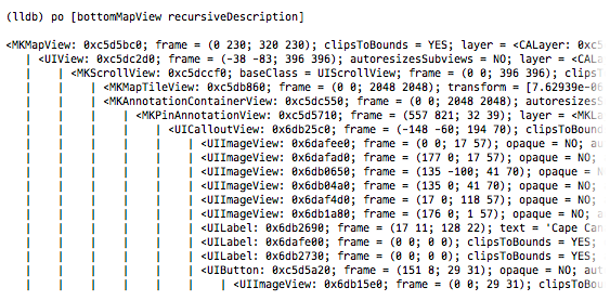
Ah ha! There’s the UICalloutView exposed, and
all its subviews: the background images, the accessory views, the
title and subtitle. So that’s an easy way to figure out the
precise x/y of subviews without having to make guesses then
compare results in Photoshop.
Animation

I expected the animation was going to be the hardest part to get
right. Fortunately,
Matthias Tretter pointed
me to
Sam Vermette’s
excellent custom
CAKeyframeAnimation.
This animates the “transform.scale” property of a
CALayer such that it grows from nearly invisible to a
bit greater than 100%, then “wobbles” once into the
final size.
Sam’s animation was almost perfect, but when I compared it
to UICalloutView animating in the iOS
Simulator’s “slow-mo” mode, the timing seemed a
bit off. So I ran some tests that printed the
UICalloutView layer’s current animations on a
timer, and discovered that Apple’s “bounce” is
just a simple set of CABasicAnimations:

That got me the exact duration and scale numbers I was craving.
Now you can popup SMCalloutView and
UICalloutView in simulator slow-mode and they look
identical.
Additionally, callouts need to expand not from the center (the
default), but from the tip of the arrow. This is easily
accomplished by setting the callout layer’s
anchorPoint property.
Positioning
The callout is designed to point at whatever the user selects, in a visually pleasing way.
One thing I learned is that UICalloutView always
prefers to be in the middle of the screen. If it can scoot its
pointer left or right while keeping itself in the center,
it’ll do so. But if the target is too far away from the
calculated size of the bubble, it grudgingly moves over.

Additionally, one of my favorite tricks it can do is when you touch something that’s really close to the edge…
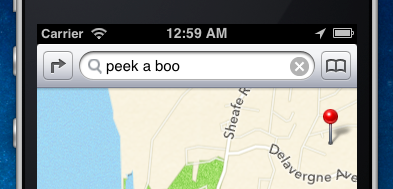
…Instead of allowing the popup to be partially offscreen, it first scrolls the map just enough to fit the callout perfectly.
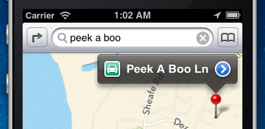
That was a lot of fun to replicate (Math!); although it does
introduce an extra wrinkle: to support this feature, the callout
view must “collaborate” with the view containing it.
This is why SMCalloutView has the delegate method
-delayForRepositionWithSize.
Extras
If you look closely at Apple’s images for their callout control, you’ll notice they have an extra graphic for an upward-pointing arrow:
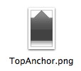
It seems like UICalloutView was designed to support
pointing up at things as well as down, but
MKMapView never activates this mode. Luckily, it
wasn’t too much work to make
SMCalloutView support it. I now present to you: A
never-before-seen upward-pointing callout view!
You can tell it to appear pointing up or down or you can let it decide for itself based on the situation.
SMCalloutView also allows you to set your own
background graphics, so you can customize your popup to make it
look all special. By default the graphics will match the system
callout, and what’s cool is that you don’t have to add
any extra images to your project to make it work: the images are
base64-encoded right into the Objective-C source (they were super
tiny).

Fin
That’s about it for SMCalloutView.
There’s more it could do in the future but I think
it’s ready to ship as-is. Go
download or fork it on Github, and let me know if you find any bugs or misbehavings, or if you
have trouble grokking how to use it.