An iOS Developer Takes on Android
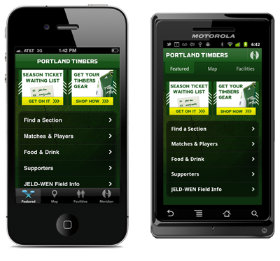
Recently, we released the Android version of Meridian, our platform for building location-based apps.
We didn’t use one of these “Cross Platform!” tools like Titanium. We wrote it, from scratch, in Java, like you do in Android.
We decided it was important to keep the native stuff native, and
to respect each platform’s conventions as much as possible.
Some conventions are easy to follow, like putting our tabs on the
top. Other conventions go deep into the Android Way, like handling
Intents, closing old Activities,
implementing Search Providers, and being strict about references
to help the garbage collector.
Now, our platform leverages HTML5 (buzzword, sorry) in many places for branding and content display, so we got a fair amount of UI for free. But there was much platform code written in Objective-C that needed translation into Java, such as map navigation, directions, and location switching.
So, we rolled up our sleeves, downloaded the Android SDK, and got to work.
Development Environment

Apple has made it pretty easy to start writing iOS apps. Of course, Step One is “Buy a Mac.” Easy! Then just download the free Xcode Installer from the Mac App Store, and start writing code when it’s done.
Android is a bit more involved. You can download the SDK easily, but to actually start writing code, you’ll want to setup Eclipse and install Google’s ADT Plugin.
If you want to waste a week or so playing around and not getting work done, you could explore the many tempting alternatives to writing Java in Eclipse. You could download Netbeans, or write in Scala, or finally start learning VIM.
But let’s assume you are on a deadline and want to do things the way that Google endorses. The first thing you’ll need to do is accept the reality of Eclipse.

You’re going to just hate Eclipse. You’re going to hate it with the heat of a thousand suns. It’s going to feel slow and bloated and it won’t taste like real food.
Eclipse is a world unto itself. It’s the IDE to end IDEs. Consequently, it has many abstract-sounding concepts you’ll have to learn. There are Workspaces, and Perspectives, and Run Configurations. And Eclipse itself is just an empty shell of sorts; all non-trivial functionality is provided via a complex network of interdependent Plugins, similar to Linux distributions. Come to think of it…
Of course, IDE weirdness isn’t unique to Eclipse; Xcode was pretty damn weird at first too, and it’s getting more meta with each release (Schemes, anyone?).
The upside is, after acclimating to Eclipse, you’ll enjoy some seriously amazing, productivity-boosting code completion, refactoring, and automatic fixing. It’ll basically write your code for you.

A great way to get comfortable with Eclipse is to spend a couple hours, and I’m being dead serious, tweaking the hundreds of options and checkboxes and fiddly things in the Preferences section.

Again, being serious here, I felt a lot more comfortable and familiar and happy with Eclipse after getting to know it this way. Does this mean that other programs should expose every conceivable preference imaginable? Jesus, no. Are you crazy?
The Java Language
Java is a high level programming language. It’s unproductive to have an opinion about it. Instead, consider how Android uses Java.
This
is how you do something on a background thread.
This
is how you listen for events (it’s actually just like a
delegate in ObjC).
This
explains the lifecycle of Activities, which are
exactly like UIViewControllers in Cocoa.
Overall, the Android frameworks are very well designed and consistent, and the API works harmoniously with the Java language. It’s actually similar enough in the fundamentals that our app has almost the exact same class structure on Android as on iOS.
And the code ended up looking strikingly similar as well. Here’s a snippet of ObjC from our app that draws an arrowhead. Hover your mouse over it to see the Java version.
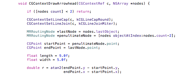
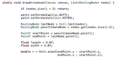
Freaky, right? A lot of our source is like that.
Debugging
Now that you’ve written some code, you’ll want to try running it. In Apple’s world, we have the iOS “Simulator.”

It’s called a Simulator because it’s phony (ha!). It’s not the real iPhone OS. When you run your app “in the simulator,” Xcode compiles your app into a desktop application, and runs it natively on your Mac. If you look in Activity Monitor, you’ll see your app right there, running alongside Mail and iCal and iTunes.
The downside to the Simulator is that it doesn’t exactly replicate the iOS environment. And your code isn’t the same either; it must be compiled for x86/64 instead of ARM, so there’s no guarantee things will work the same on an iOS device.
The upside to the Simulator is that it’s not an “Emulator.” What’s an Emulator?

Behold, the Android Emulator. Its goal is noble: to run your app on the complete unaltered Android OS inside a virtual machine that executes ARM instructions.
What is the primary quality of the Android Emulator?

I thought the iPhone Simulator was a terrible idea when I first heard of it, until I remembered that we built the exact same thing for Windows Mobile back in the day, because the Windows Mobile Emulator was so goddamn slow.
It takes the Android Emulator ~2 minutes to boot up on my perfectly-modern machine. But what really hurts is the edit/debug cycle. Every time I change a bit of Java and need to rerun the app, it takes about 30 seconds to redeploy and start up in the Emulator. Compare that to 5 seconds on the iOS Simulator. It may not sound like much but remember you’ll be doing this hundreds of times throughout your day.
Fortunately, it turns out to be much quicker to deploy and boot up your app on a physical device over USB. So trust me, just go out and buy an Android phone. Better: buy a few of them to test against fragmentation.
Not that fragmentation is unique to Android; it’s just exaggerated a lot in the media. We need quite a few iOS devices in our lab too. One tiny unexpected OS or device difference can bring your app crashing down, on any platform.
UI Design Tools
For laying out widgets on iOS, we have Interface Builder.

Your experience with Interface Builder may differ from mine, but
I’ve learned to use it very sparingly. It’s great when
you want to create static layouts with precision. But for dynamic
content, especially UITableViews, it tends to make
things more complex than they would be in code.
Especially when you come back after a while and forget all the
little dependencies between your Controller and your
XIB.
On Android, you can create UI layouts in XML.
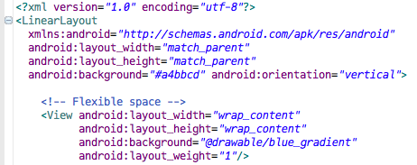
It’s a bit like HTML, except it’s not HTML. It has a basic styling system that’s kind of like CSS, except it’s not CSS.
Lots of well-meaning developers in positions of power have tried to reinvent HTML and CSS over the years. Mozilla created XUL for cross-platform UI in Firefox. Adobe created MXML for Flash. Microsoft created XAML for Windows.
I myself am guilty of creating my own XML-based layout system for Flash called Bent, back when I had too much free time. So I can tell you that inventing these systems is the most fun you will ever have as a developer. It feels like you are creating the One True Framework, and once it’s complete everyone will embrace it and get excited about it and learn it and build on it, and hold you up and sing epic poems about your genius!
But the reality is, it’s not HTML and CSS and so it’s another thick layer of stuff that you have to learn and understand and fight with when things don’t work like you expect.
On the plus side, you can preview your XML at design-time in a nice visual editor, much like Interface Builder:

Which is pretty grand.
Now, technically you could write everything in Java, just like on iOS you can eschew Interface Builder entirely and write only Objective-C. But you’ll find that when you scour the Internet for how to do a thing on Android, you’ll end up needing to understand all these XML formats anyway just to understand code samples on the web.
But it’s not really that bad, because you also get…
A Real Box Model
Here’s a list item on iOS that represents a search result.

And here’s just a snippet of the ObjC that renders that item:
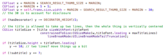
Talk about a bag of hurt. You could create the initial layout in Interface Builder of course, but then you’d have to kiss that silky smooth scrolling goodbye. Maybe in the future when iOS devices are blazing fast.
As humans, we don’t typically think “The title should be positioned at 30 pixels by 40 pixels, with a maximum height of 35 pixels.” Instead, we think “The title should be above the subtitle, and to the right of the thumbnail image, and have at most 2 lines.”
Android has a system of layout containers (similar to HTML) that let you describe where content should be, relative to everything else. Here’s a similar snippet from the same search result in Android:

Now, you’ll have to study up on all these layout containers
like FrameLayout, LinearLayout,
RelativeLayout, and learn all their quirks, but in
the end you’ll get a very natural, flexible UI layout
system.
The best part is that it’s zero-effort-easy to make layouts that automatically resize for portrait/landscape device orientations and varying screen sizes. This is in stark contrast to the absolutely primitive springs and struts system in Cocoa/iOS.
But here’s the thing about the simplistic layout system in iOS that I just mocked, it turns out to be a reasonable compromise when you consider…
Animation
The thing to realize about Android is that it used to look like this:

It was conceived and designed during the pre-iPhone days of Blackberry and Windows Mobile, and the influence of those platforms goes very deep into the Android OS.
For instance. The rendering system, that is, the method by which UI widgets like menus and buttons and such get painted on the screen, is primarily software-based.
What does that mean? Let’s take the screenshot above as an example. If you pressed the Down key, you would expect the “Homepage” entry to be selected instead of “Go to.” So you press the Down key. This causes an “invalidate,” meaning, “please repaint the screen.” So the screen is cleared, then:
- The OS redraws the status bar at the top
- The WebView redraws the Google.com website
- The Menu draws its translucent black background and border
- All the menu text is drawn
- The blue gradient highlight is drawn over “Homepage.”
This all happens very quickly, and you only ever see the final result, so it looks like just a few pixels have changed, but in fact the whole screen must be reconsidered and redrawn.
If this sounds familiar, it’s because this is the basic method used in GDI, the rendering system introduced with Microsoft Windows 1.0. That sounds damning, but really most GUIs operated this way.
Until the iPhone came along…
When you’re using an iPhone, you’re playing a hardware-accelerated 3D game. You know, the kind of 3D where everything is made out of hundreds of little triangles.
When you flick through your list of friends in the Contacts app, you’re causing those triangles to move around. And there’s a “camera,” just like a 3D shooter, but the camera is fixed above the Contacts app’s virtual surface and so it appears 2D.
Which is a long way of saying that everything on iOS is
drawn using OpenGL. This is why animation on iOS is so hopelessly
fast. You may have noticed that -drawRect is not
called for each frame of an animation. It’s called once,
then you draw your lines and circles and text onto an OpenGL
surface (which you didn’t even realize), then Core Animation
moves these surfaces around like pulling on the strings of a
marionette. All the final compositing for each frame is done in
hardware by the GPU.
Android seems to have made the decision early on that they wouldn’t force their manufacturing partners to include a GPU. This decision made total sense back in the pre-iPhone days, but now it’s causing pain, as even the new hardware acceleration in Android 3.0 is limited by the original software-based compositing system.
So here’s the catch with the wonderful flexible layout system in Android: You must be very careful. If you animate certain kinds of properties, you can easily force the CPU to do all that fancy, expensive layout on each animation frame. And the CPU is very busy right now parsing some JSON from a web API or something, OK?
Meridian For Android
All in all, it took us about 4 months of development time to build and release Meridian for Android.

When we first released Meridian, our number one piece of feedback was “Will you make an Android version please?” Except often without the “please.”
And it turns out Android is the third platform for Meridian. The first was Windows Mobile, if you can believe that.

We started building what we now call “Meridian,” back before the iPhone existed. At the time, Windows Mobile was the only mobile platform capable of delivering the experience we wanted.
So you could say I’ve got a rather long view of things now. There will always be new platforms and new paradigms to learn. The best we can do is to understand where each one came from, and to embrace the positives and overcome the negatives as quickly as possible so we can ship some awesome features before everything changes again.
